Grading System for the University
/confidential/
I was working as a UX Designer / UX Lead in this project, in a team with two other colleagues: a technical lead and a graphic designer.
CHALLANGE:
Design the internal system for the University, that would repleace the existing one (old and in depreciated technology). The system had to allow for giving the final grades for the students and store it/send it to the secure system.
Although it might seem this was just simple project, the circumstances made it more difficult than expected.
First, there were a hundreds of academic teachers using it, all of them with different expectations.
Second, there was already working system, but extremely uneffective and frustrating for the users.
Thirds, there were a lot f stakeholders for this project, each of them with the different vision, not necessery going with UCD approach.
I started with the research. I tried to know the existing system as good as possible. I analized the functionalities and user paths. I identified the problems and user struggles. By accident, I had an opportunity to access a grading system in two different Universities in that time (also confidential), so I reviewed them and got acquainted with competing solutions.
Once I had an overall understanding of the requirements and expectations of stakeholders, I organized the interviews with the users. I invited them to the University building and conducted 1-to-1 talks, asking them to show me their flows in the existing systems. I was pretty lucky - the users I invited were keen to help and some of them came with the lists of the insights!
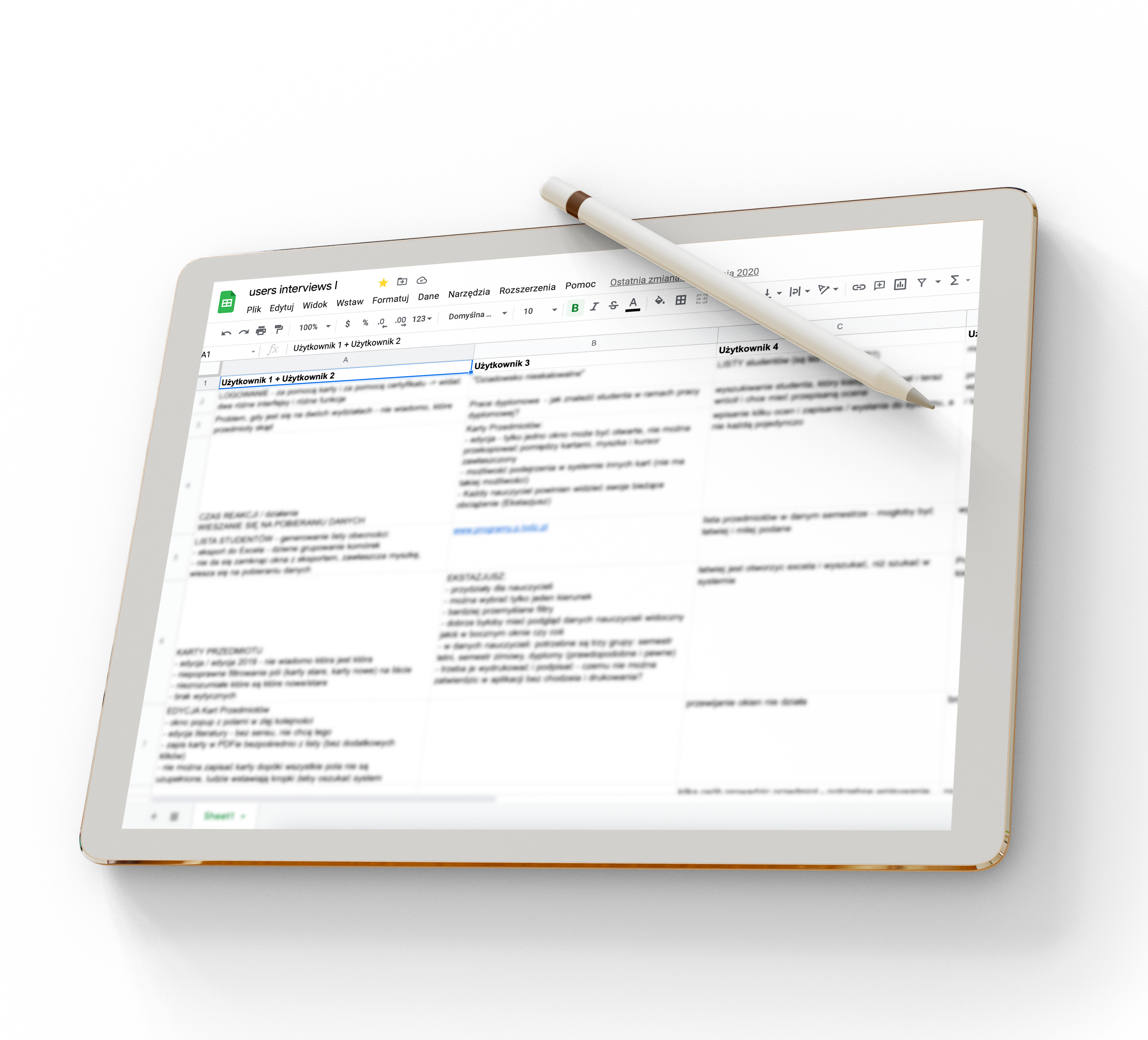
the summary of interviews with the users
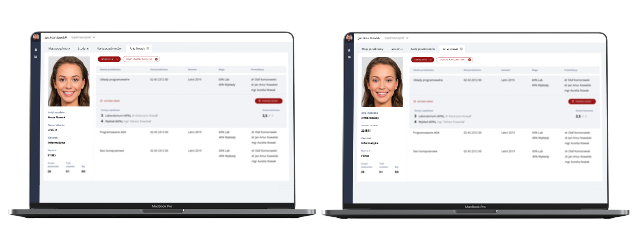
Once I had enough understanding and knowledge about the users, I started to move the ideas from my head to Adobe XD. I went to the stakeholders and representatives of the users with first bunch of the wireframes. Unfortunatelly, they had a problem with understanding the user flows, so I decided to create a clickable prototype. After couple of iterations I managed to cover all functionalities in the wireframes. Though, I had a feeling that digital sketches are not taken seriously by the stakeholders.
wireframes/prototype
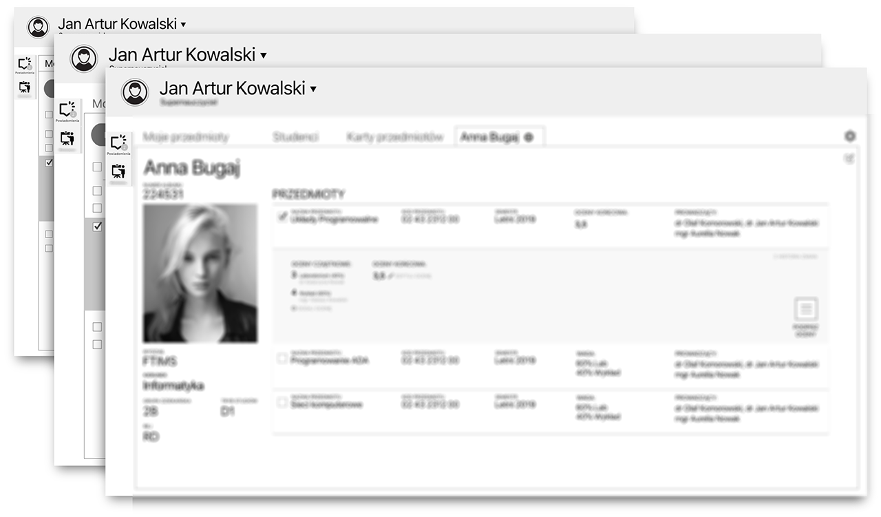
Together with graphic designer we started to create the visual design. We covered main screens with high-fidelity mockups using Adobe XD. For easier navigation, we added IxA to the design, so we ended up with the small prototype build with visual designs.
As expected, only now the stakeholders started to take this project seriously. The discussions started, we went over every button and every link in detail. In the end, we mockuped with hf designs the entire prototype and used it in this form later during the second round of user interviews.
visual design
Clickable, colorful prototype build with the visual designs was perfect for testing with the users. I organized another round of the interviews - 2 days session. I met the users to whom I already talked to, and the new ones. They were happy and excited, waiting for the real system to be launched.
I couldn't wait neither!
Other projects
Product rebranding!Leadfeeder, Dealfront
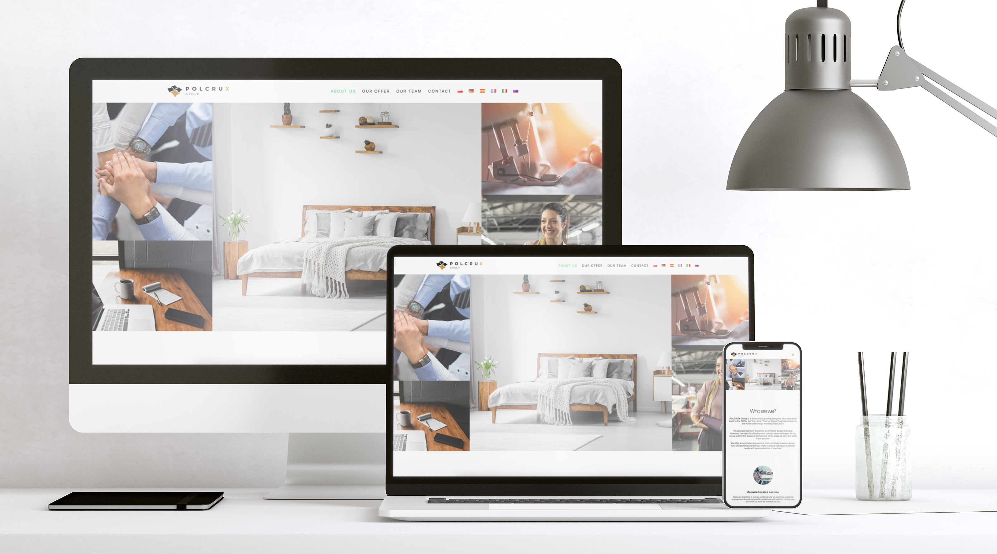
Website & content designPolcrux
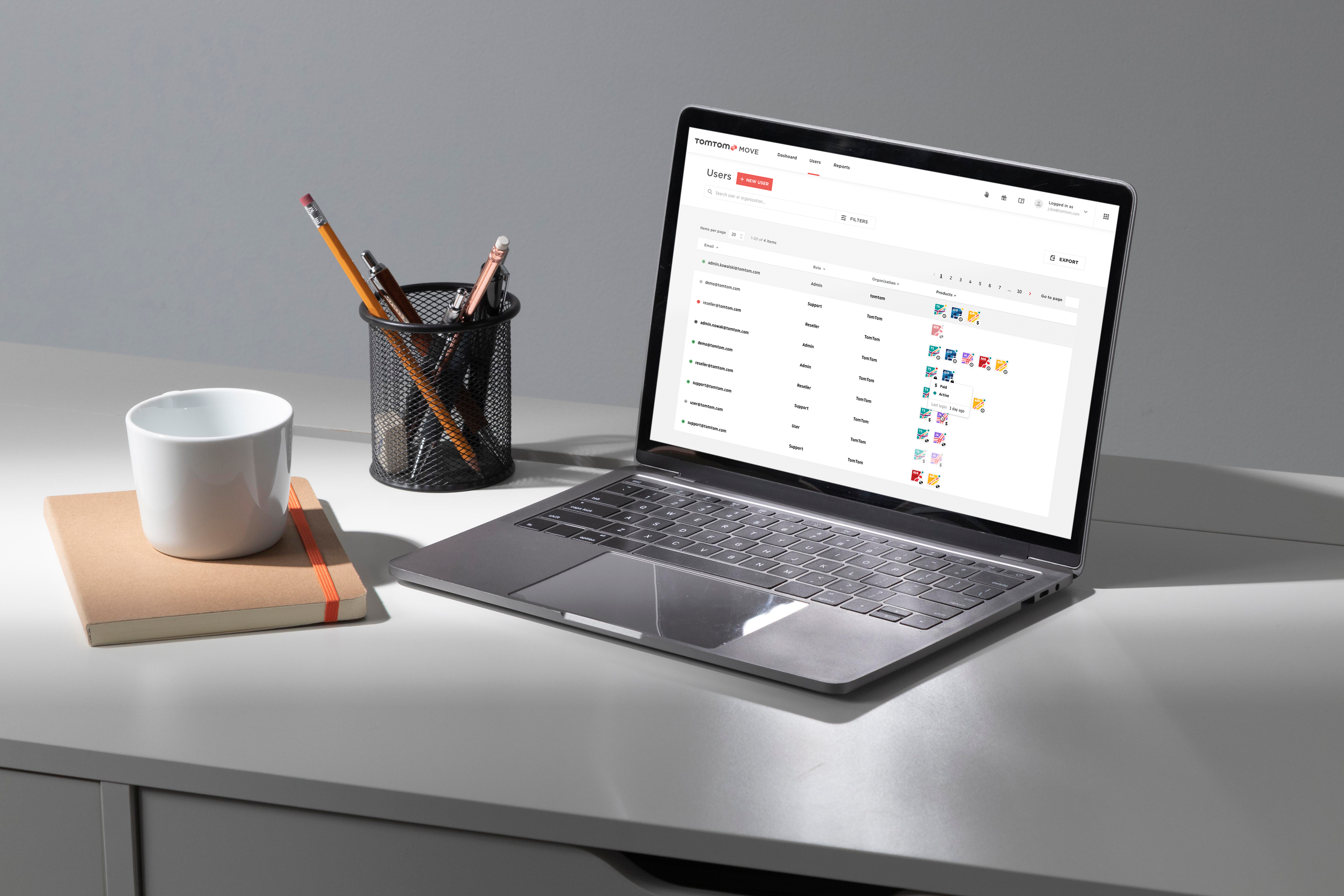
Product design (SaaS Platform)TomTom / Move Portal / User Management
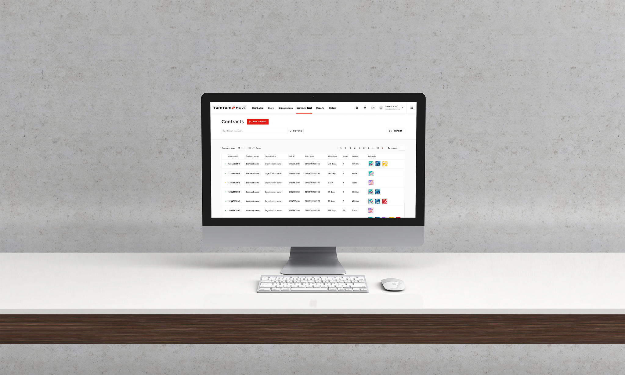
Product design (SaaS Platform)TomTom / Move Portal / Contracts management
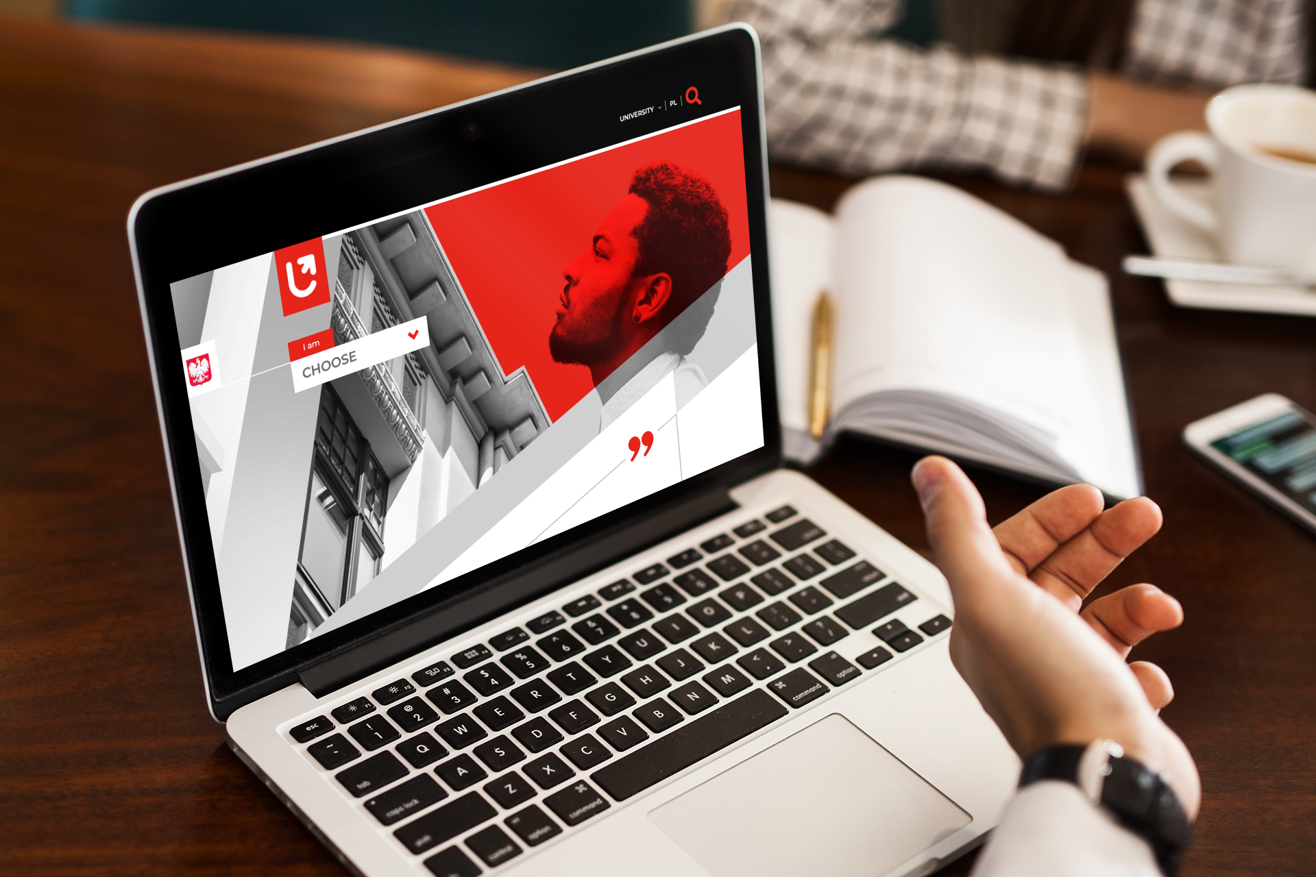
Multiportal designDesignign Multiportal solution for University of Lodz
Web App for HealthcareProduct Design of a web application supporting patients and nurses | Connect360
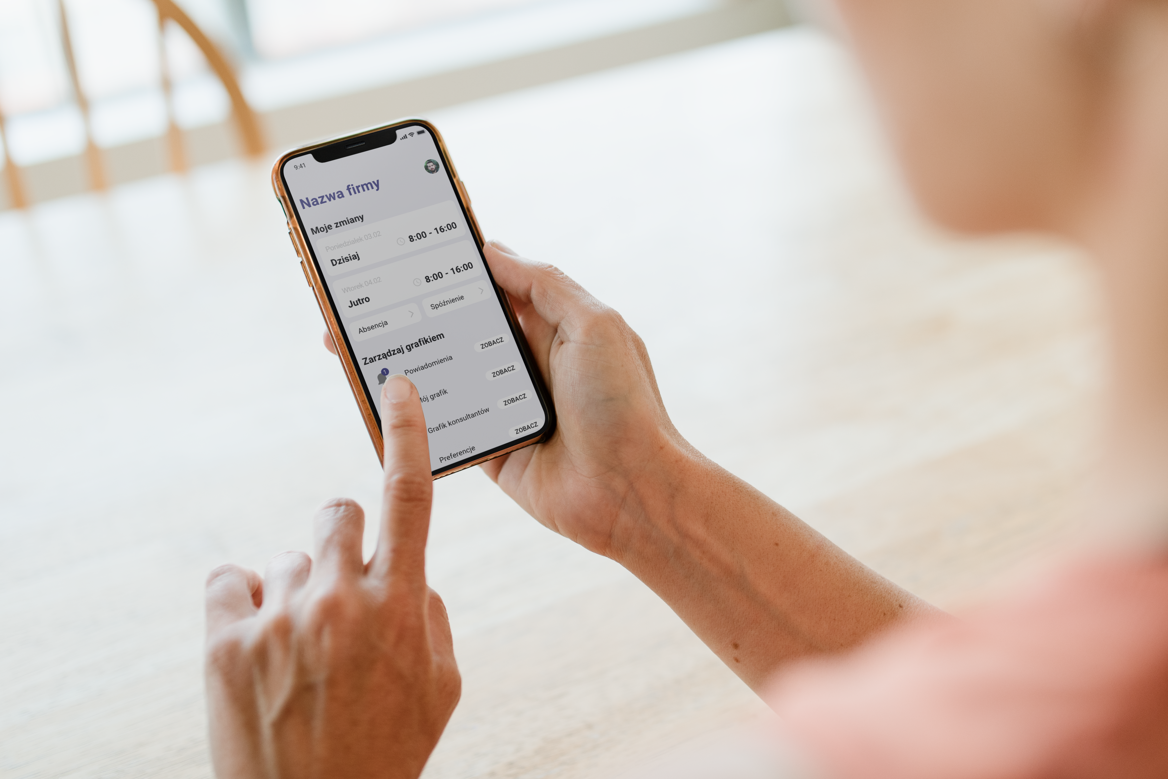
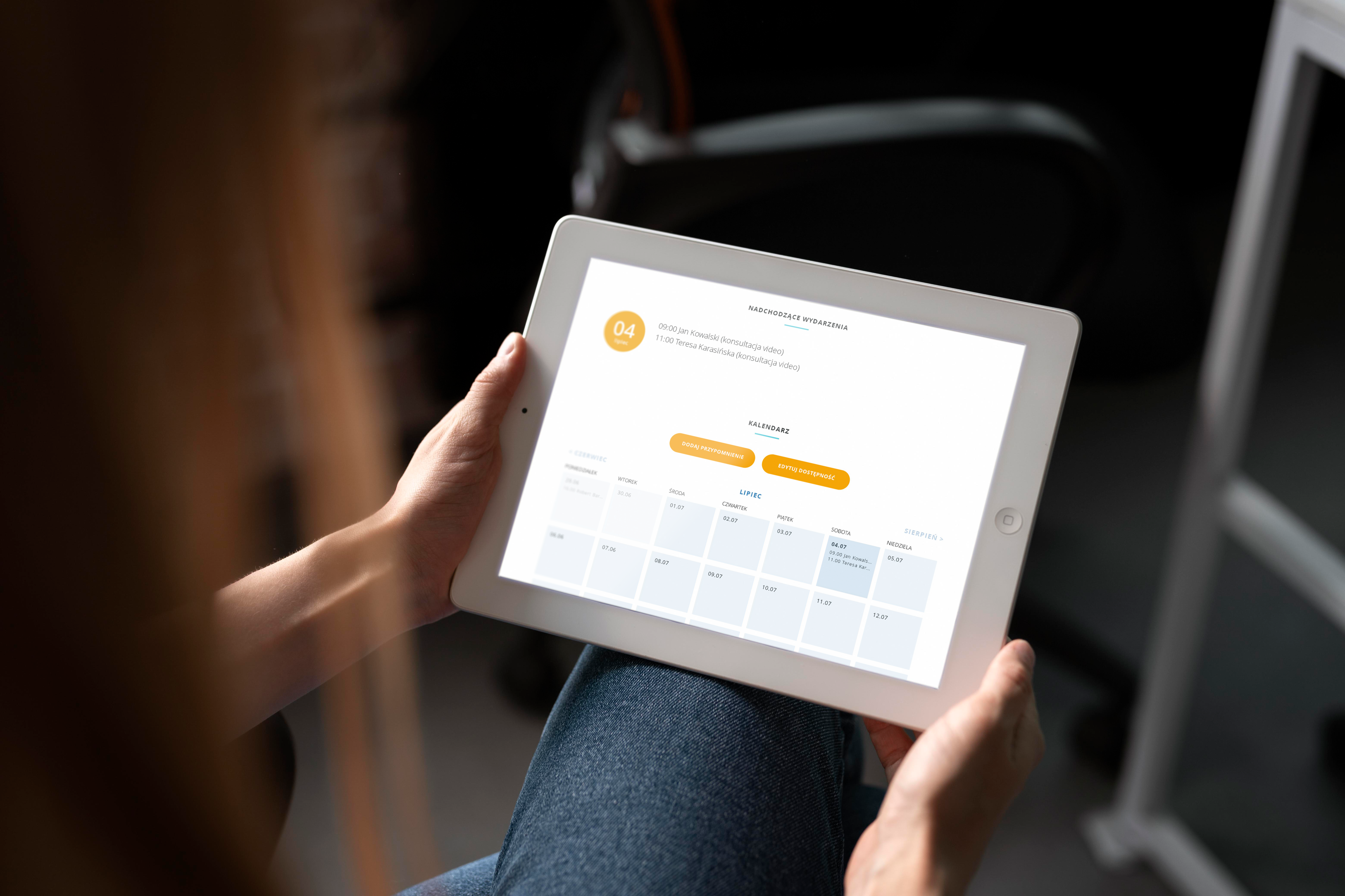
Mobile App DesignWork&time management application design
Web&mobile based system for financial sectorIntegrated banking platform catering to high-end clientele, offering web and mobile support for bank employees.
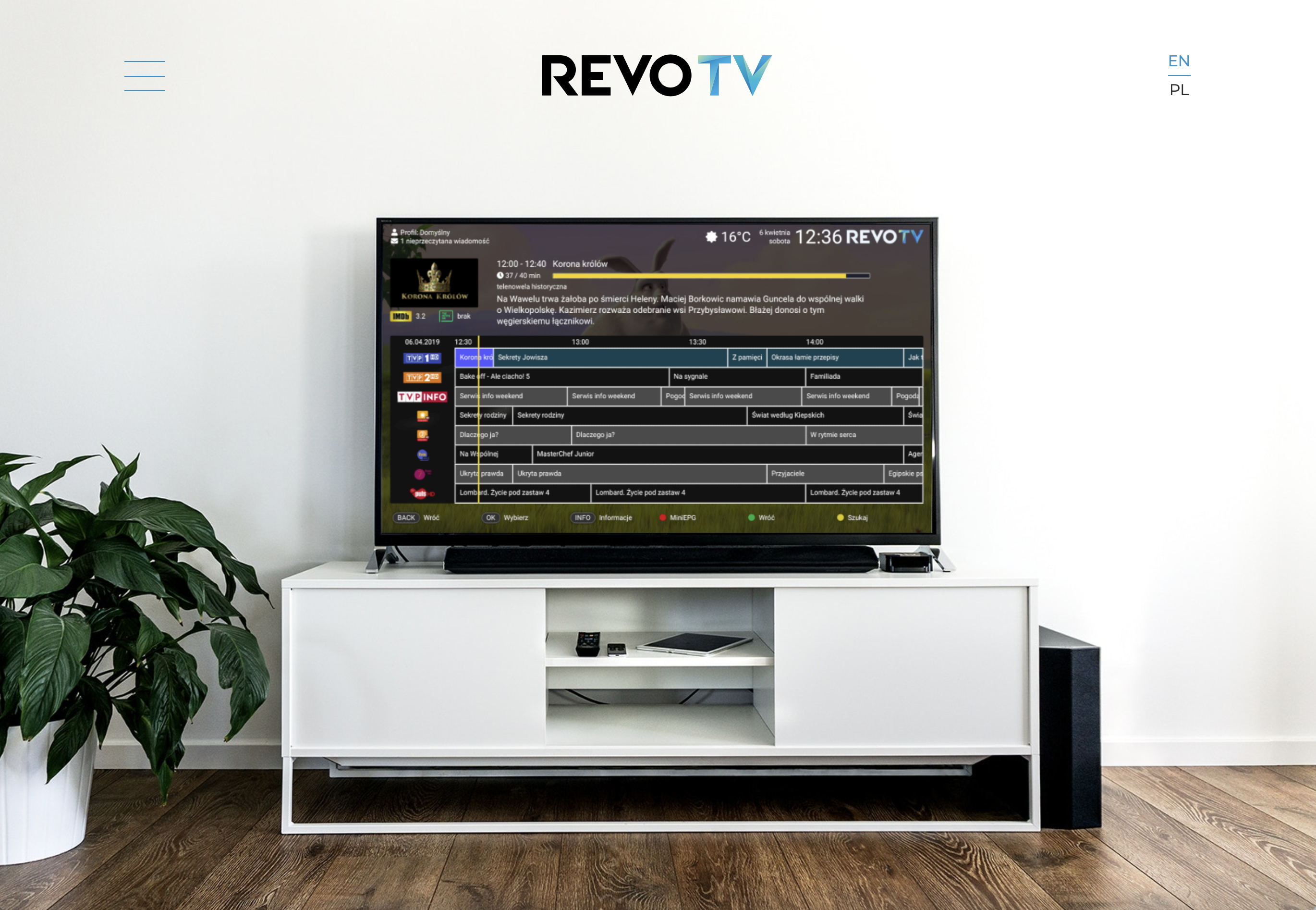
TV-Box ecosystem designProduct design for the TV-box ecosystem | RevoTV